
-

-
Featured Products
-
Topics
-
-
Latest Videos
-
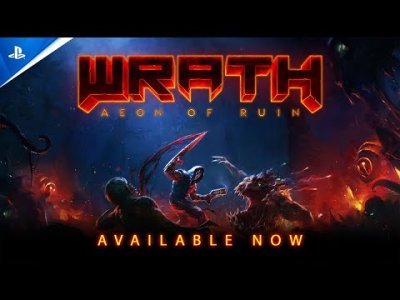 0PlayStation - Wrath: Aeon of Ruin - Launch Trailer | PS5 & PS4 Games
By: Commander Fury · 04/25/2024 · 0 views -
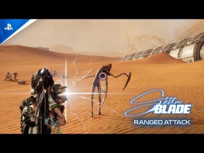 0PlayStation - Stellar Blade - Ranged Attacks | PS5 Games
By: Commander Fury · 04/25/2024 · 0 views -

-
 0XBox - That Time I Got Reincarnated as a Slime ISEKAI Chronicles | Announcement Trailer
By: Commander Fury · 04/25/2024 · 0 views -
 0XBox - New Season 3 Reloaded Modern Warfare Zombies Update | Call of Duty Modern Warfare III
By: Commander Fury · 04/25/2024 · 0 views
-


Recommended Posts
Join the conversation
You can post now and register later. If you have an account, sign in now to post with your account.